CARA MIA
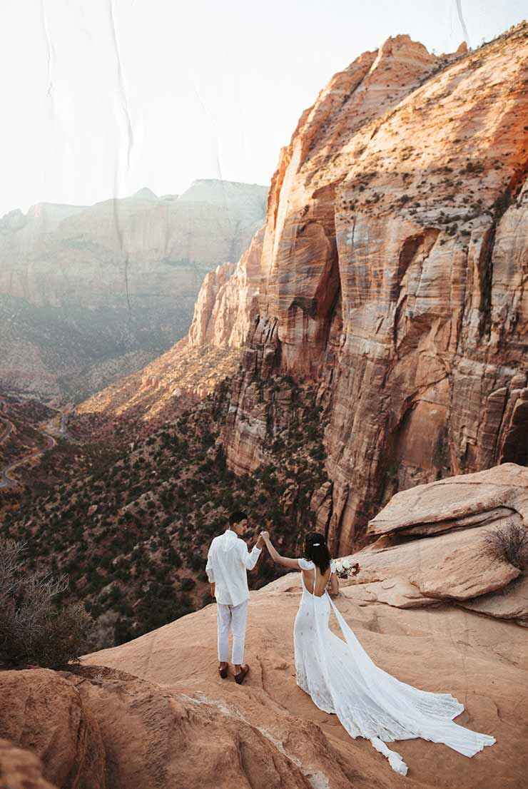
An incredibly talented photographer wandering earth's most offbeat & untouched locations, capturing breathtaking, otherworldly images of human connection. Her work speaks its own language — of intimacy, warmth & adventure.
Intro
I completed this project in partnership with SOUL TWIN STUDIO, who created a dreamy & magical design, which I was delighted to bring to life. I'm incredibly grateful for this connection, because everything just clicked between us from the very start. There was some kind of unspoken understanding at all times, so that I constantly hit the right notes. It was beautiful.
The Beginning
There I was. With this mind-blowing design. And it was clear to me from the very start that this would not become a simple website. This would become an experience. I was almost bursting with ideas and it makes me so happy to see how many little details made it into the final build.
Transitions
A major part of my work involved the conception & implementation of all page transitions, interactions & animations on the site. Both Cara & SOUL TWIN basically let me run wild here and this kind of blind trust felt incredibly good and was so much fun.
Randomisation
Cara's work embraces an organic & natural character. So one of my ambitions was for every animation to feel unique in some way, just as no two movements in nature ever repeat exactly the same. And so a theme emerged that now runs through the entire site, and that is Randomisation. And if you look closely, you'll notice that no two page transitions are the same, because with each run, the order of all animated elements is shuffled.
Individual pieces
In order to bring the randomisation theme to life, with each transition the whole page is broken down into individual pieces: words into letters, frames into lines. Per page, between 50 and 100 individual elements are extracted and finally animated sequentially using a combination of fade, scale and blur effects.
Landing
Cara's website includes more than thirty unique page designs. At this scale, small landing pages in between create clarity and ensure an easy flow. To turn these rather low-content pages into small experiences, i've infused them with some subtle animations.
Moving in circles
When hovering over the links, the two background circles change their position & size, creating a unique shape with each interaction, almost like a little dance. Once again, the randomisation theme comes into play, because no movement ever matches another.
Portfolio
As one of the core components of her website, Cara's portfolio has received significant attention during development. On the portfolio detail pages, visitors can dive into her work using three different views: a highlight overview, a medium-sized grid view and a full-resolution detail view.
Highlight overview
This first view features an introduction to the selected project, showcasing some hand-picked highlight images from the shoot. A wide-screen slideshow on the left with an interactive thumbnail sidebar on the right. Simple fades complement the experience.
Grid view
This second view can be opened with a toggle and features an overview of the selected project, showcasing all images from the shoot in a responsive grid. Clicking any image automatically opens it in the third and final detail view.
Detail view
This third view features full-resolution & rich detail shots and can be explored through scroll interaction. It showcases all images from the shoot in a unique & loosely arranged grid. What’s special here is that Cara can create her very own personal templates for these pages in the back-end, using a variety of predefined layout blocks. This way, every project becomes an individual eye-catcher.
Info
This section of Cara's site covers some general background information like pricing, frequently asked questions & reviews. In addition, her editing style & astrophotography are discussed in more detail.
How I edit
This page is meant to give visitors a better understanding of Cara's post-production process. My main focus was to develop the "before & after" component, which can be used on desktop (using hover interactions) and mobile (using drag interactions). And to be honest (pssst), this page actually marks my favourite design of the whole site.
Pricing
An interactive pricing calculator gives potential clients initial insights into the possible costs involved when working with Cara. And if her services ever change, Cara can easily update the options in the back-end.
Reviews
Clicking one of the titles or images will open the corresponding review in the accordion. That's already it here.
Learn
A meaningful part of Cara's services lies in the field of education. Besides numerous online courses and one-on-one mentor sessions, she offers a variety of in-person group courses. My responsibility was not only to develop all the related pages, but also to create a seamless integration with the e-commerce system.
Courses
Building this page was slightly tricky, as both slider, accordion & hover interactions are combined into a single component. However, these kinds of tasks hold tremendous potential for growth. And finally experiencing something in full function that previously only existed conceptually is such an amazing thing.
Mentor sessions
Simple hover interactions reveal a separate layer with more information about each particular session. Despite this being a rather subtle animation, the varying background colours produce a strong visual effect here.
Shop
Cara's online store is packed with everything you could ever wish for from a professional photographer: prints, presets & brushes, albums, guides and so much more. The main task for me was to maintain the previous smooth feel of the site without sacrificing functionality of the store pages.
Prints
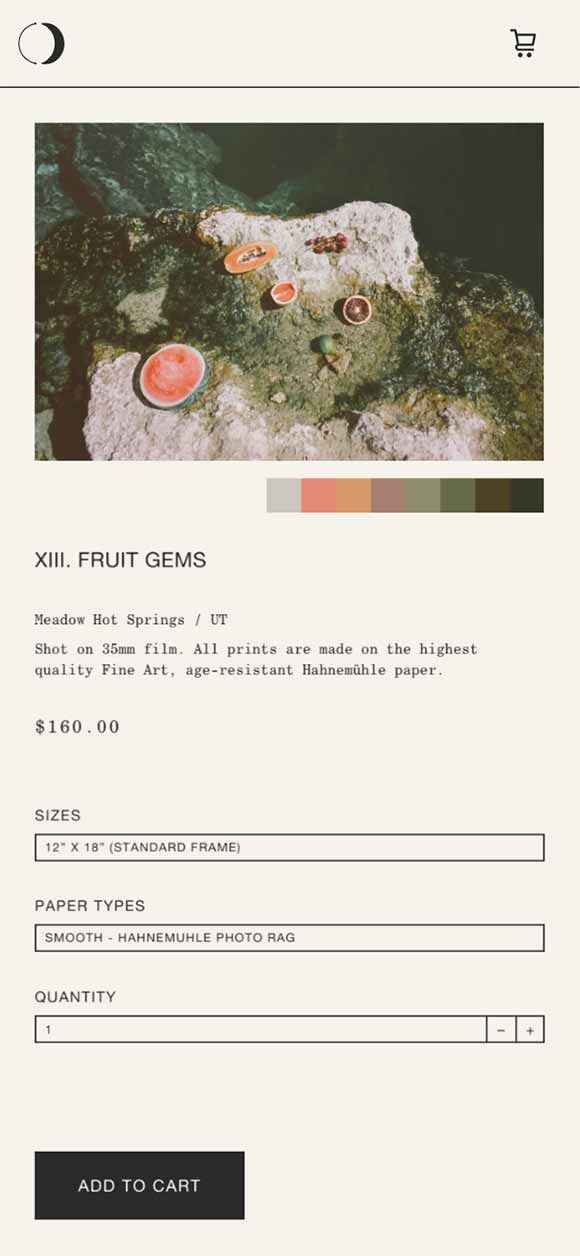
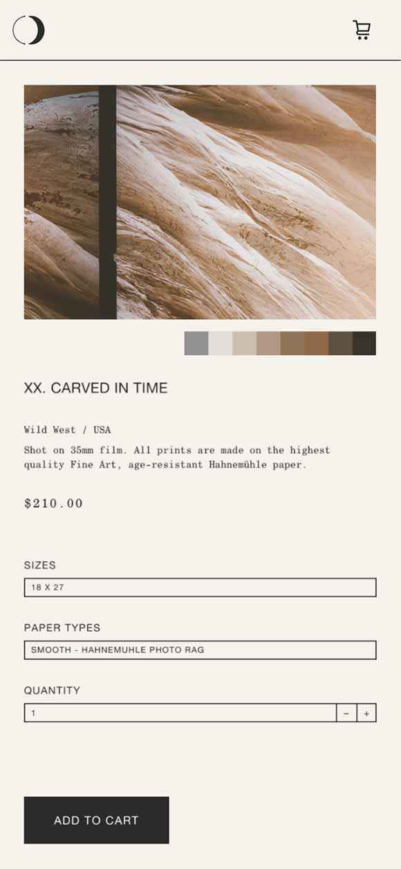
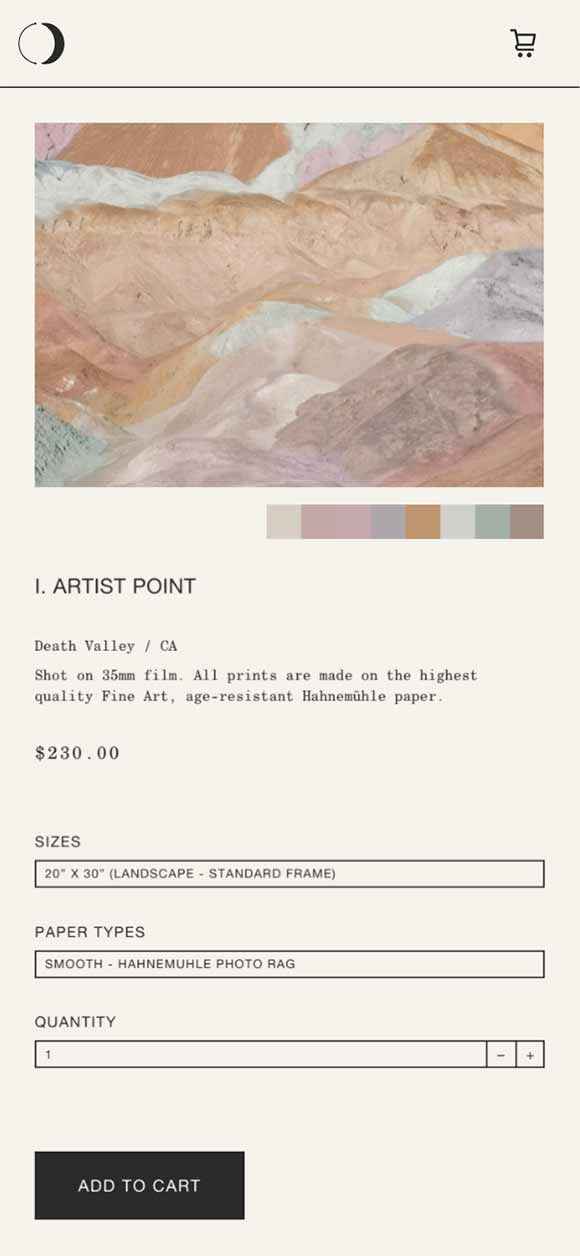
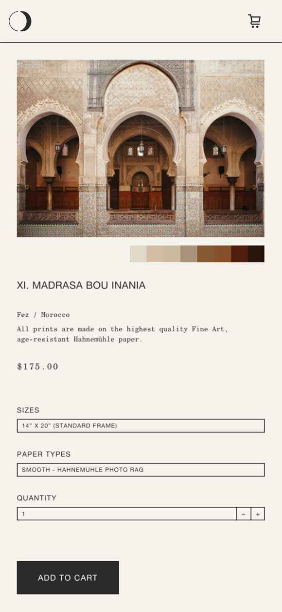
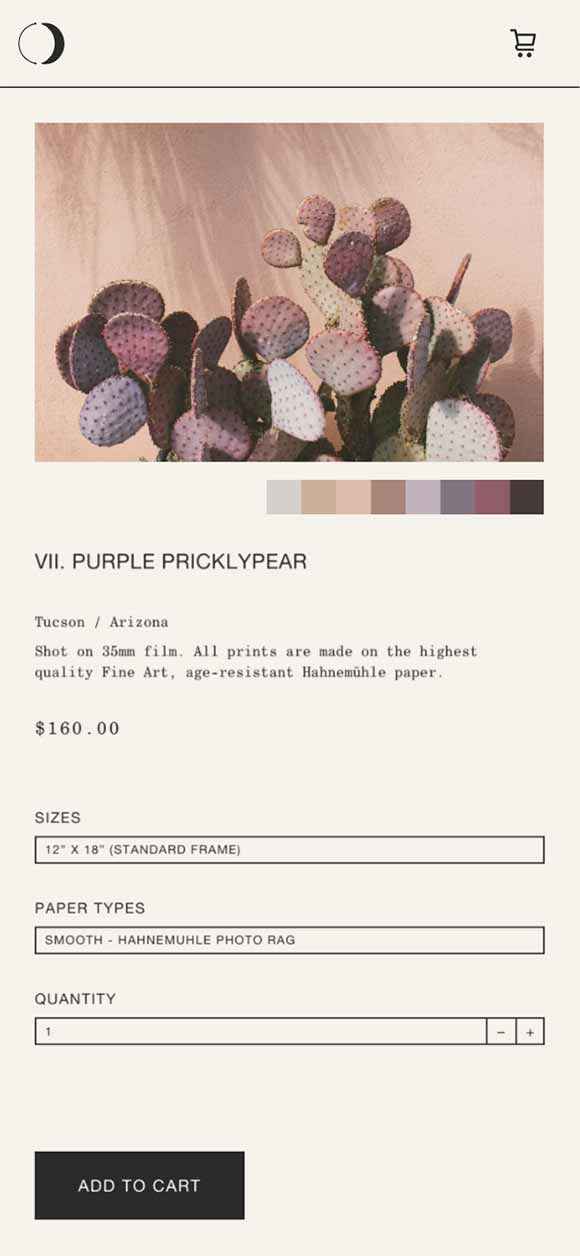
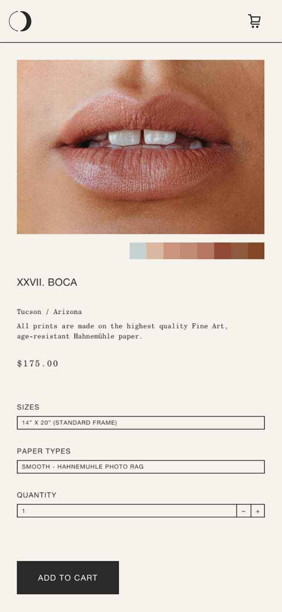
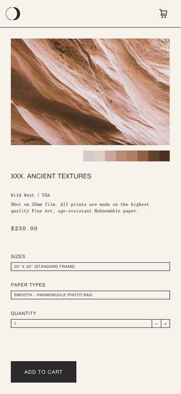
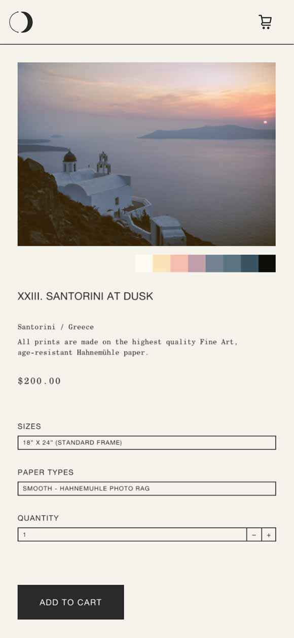
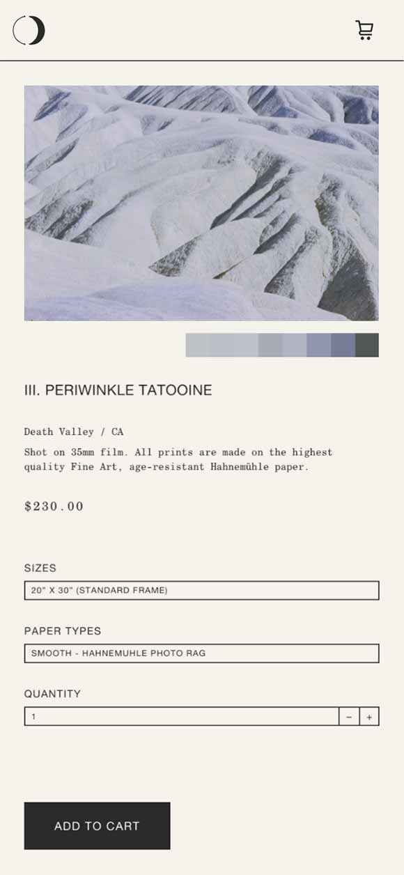
For each print product, Cara can add variants such as alternative paper sizes or paper types. In addition, up to 8 different colour values can be specified, generating a colour matching design for each individual image.
Checkout
Obviously my ideas didn't stop at the checkout page. After all, the entire site should follow a consistent flow. So again, numerous smooth interactions came into play, turning the overall shopping process into a well-balanced experience, from start to finish.
