SOS Foods
A startup selling food products invented by two caring young founders. Their goal is to reshape fair trade by contributing a substantial part of each sale to social projects in the source regions. I spent three months shaping this minimalistic web project in close collaboration with them and I'm so happy with the result.
Products
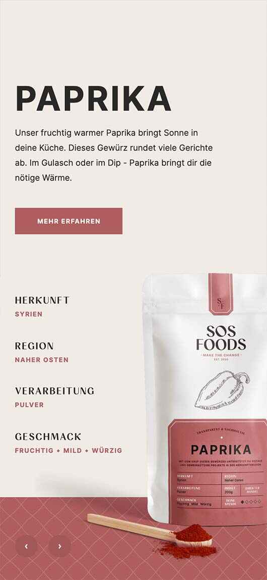
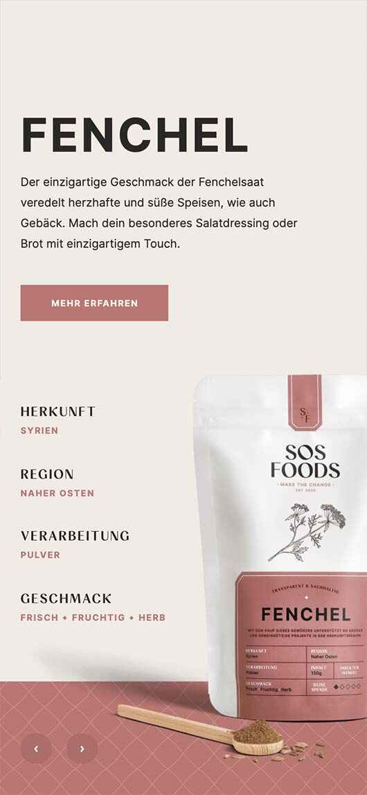
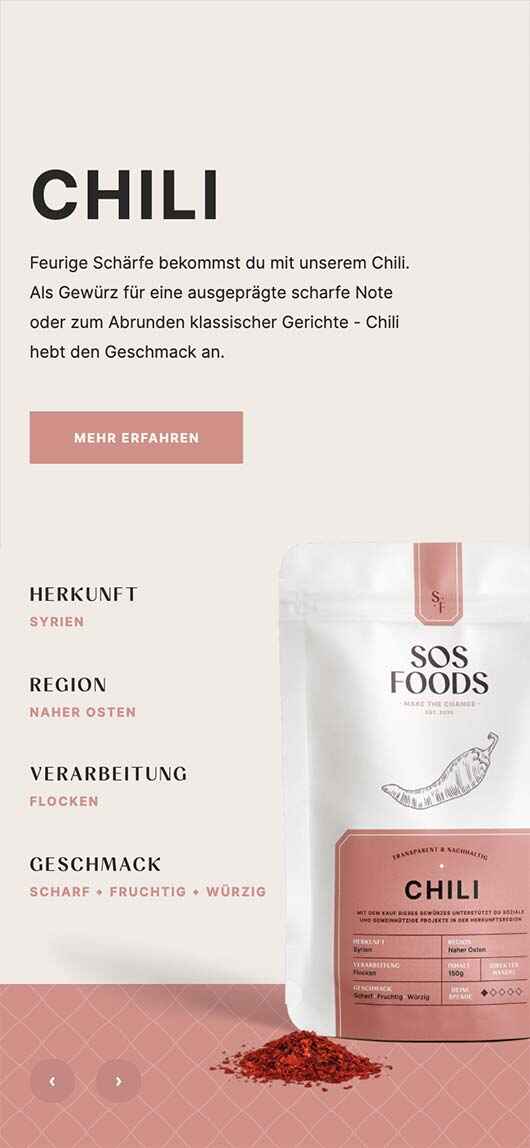
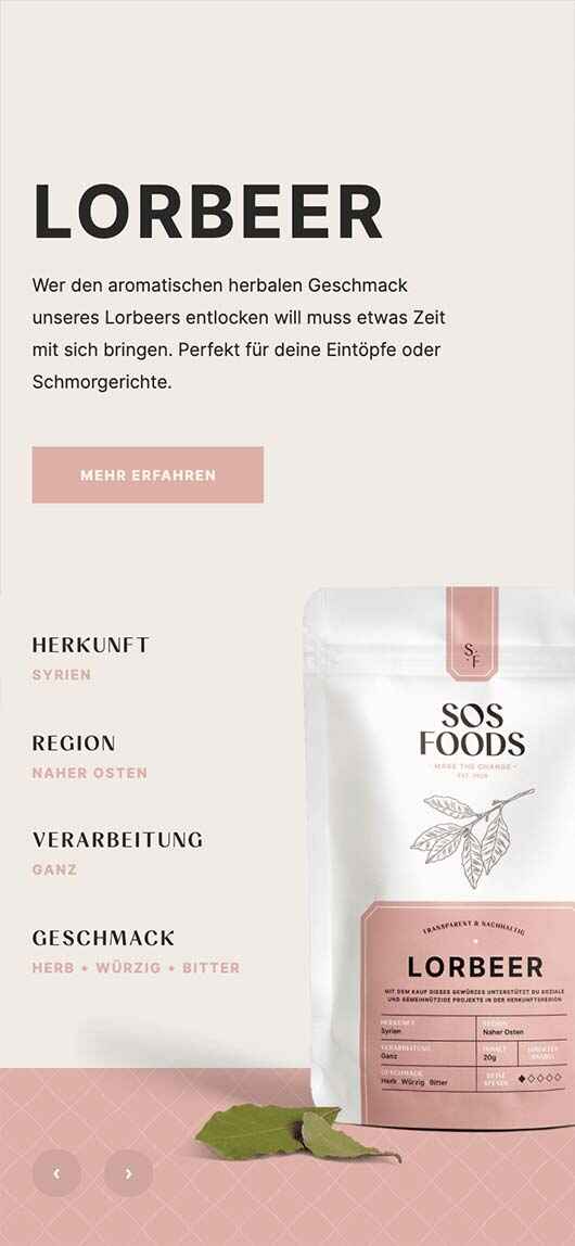
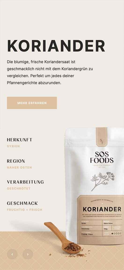
The heart of every online shop are its products. That's why we intended to give each item enough space to tell its own very personal story. It was never about promoting quick sales, but rather about slowing down the pace of life for a moment and inviting users into a more conscious way of shopping.
In focus
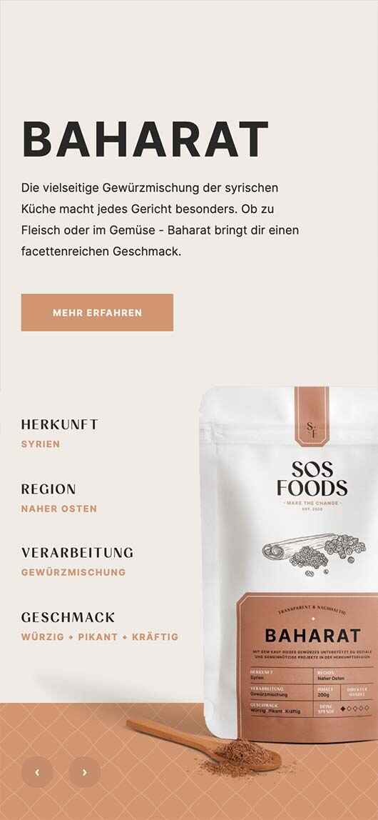
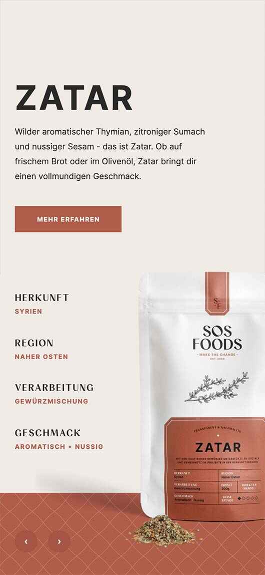
Each product page opens with an individual & inviting introduction. Various elements (images, illustrations, text, colours), created in collaboration with several other team members, were carefully combined to create unique compositions for each item.
Discover
Scrolling down, users are taken on an inspiring little journey where they can explore detailed information on the taste, application and cultivation of the particular item. Here, everything revolves around the product. Literally.
Spice blends
Because spice blends are a combination of multiple components, they feature an additional section on their product page to provide transparent information about the ingredients.
Shop consciously
In comparison to many other online shops, fewer purchase options were intentionally added to the design. This way, users are invited to shop consciously. Prior to a potential purchase, they will be given sufficient information about both the product and the company's philosophy.
Shop
The shop pages provide a clean overview of all available products. It also offers a faster purchase option for returning customers.
Find your fit
Thanks to an intuitive filter, a desired product can be quickly narrowed down with just a few clicks. For example, customers can search for an aromatic spice to go with fish.
Keep track
A digital shopping cart with a variety of features is always at hand. When a product is added, it opens automatically to ensure that users have their current order in view at all times.
About
The company, its founders and philosophy have their own dedicated space on the website as well. With so many great values, there's a lot to talk about.
Reshaping fair trade
SOS Foods contributes 20% of each product's purchase price to social projects in its source region. This core feature is therefore highlighted prominently on the home page.
One for all
In addition, each product follows the company's unique philosophy, consisting of four central features: Sustainability, Transparency, Recyclability and naturalness. Subtle animations bring them to life.

The regions
All SOS Foods products are categorised according to their specific source region. Due to the close relationship with local producers, the company has deep insights into each particular region. On individual pages, users can find additional information about each region and view its products.
Shooting
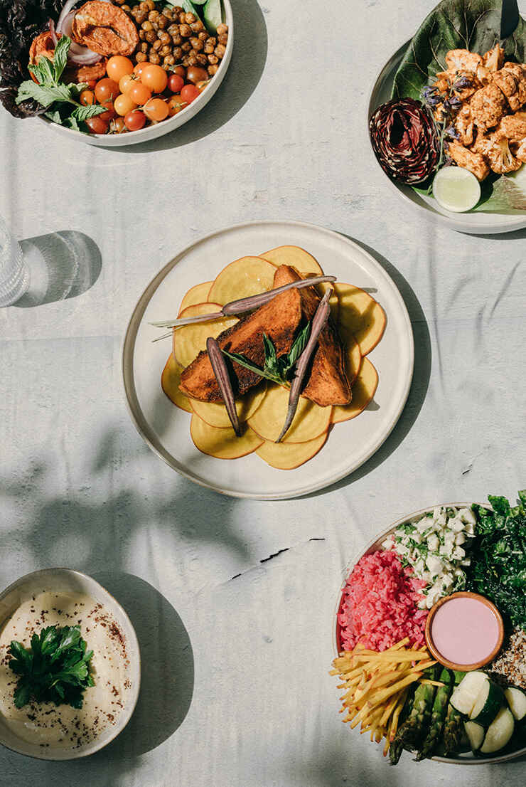
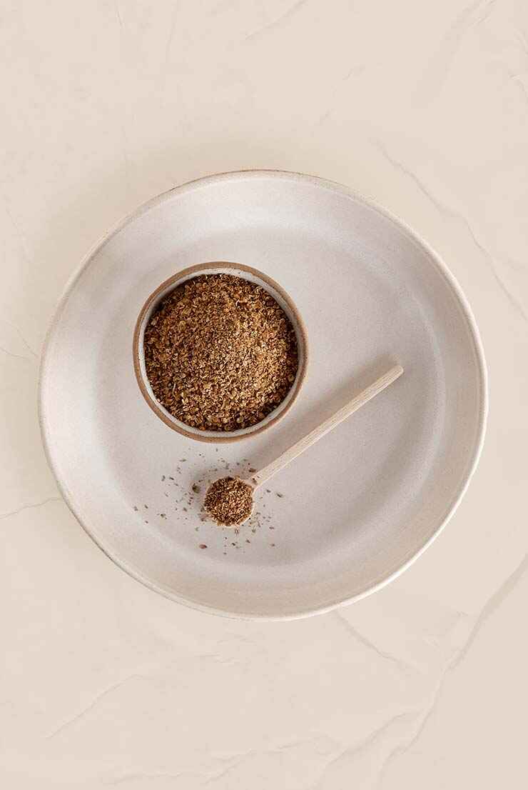
An extensive shoot was essential to set the scene for the overall site and other platforms. It was mainly carried out by other team members, however, I was also on site and assisted in the art direction and editing of several images.
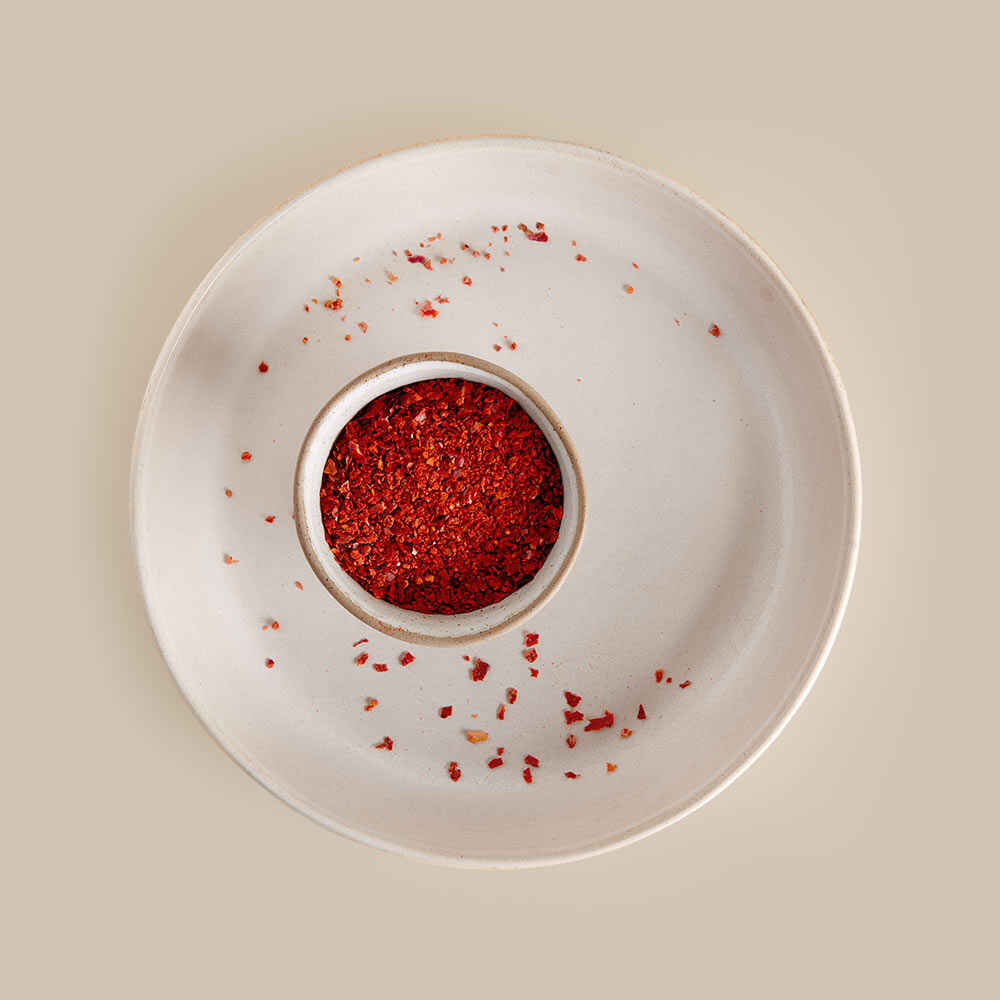

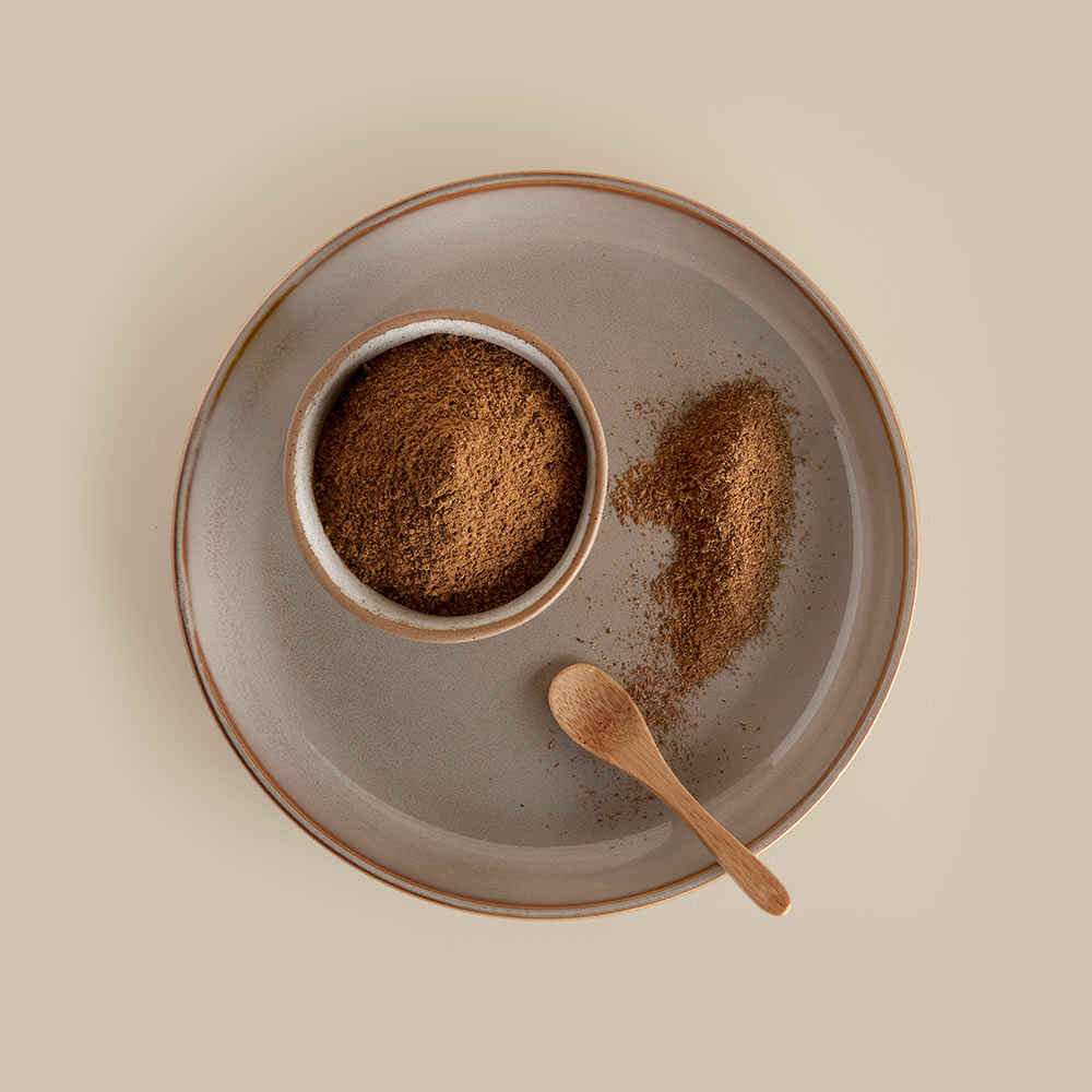
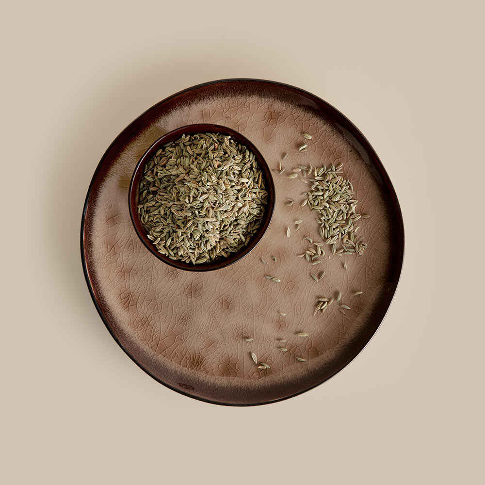
Top shots
A close collaboration with the other team members is fundamental for a professional & consistent outcome. I believe that a harmonious atmosphere throughout the project will reflect the result in a positive way. And that's been particularly noticeable in this one.
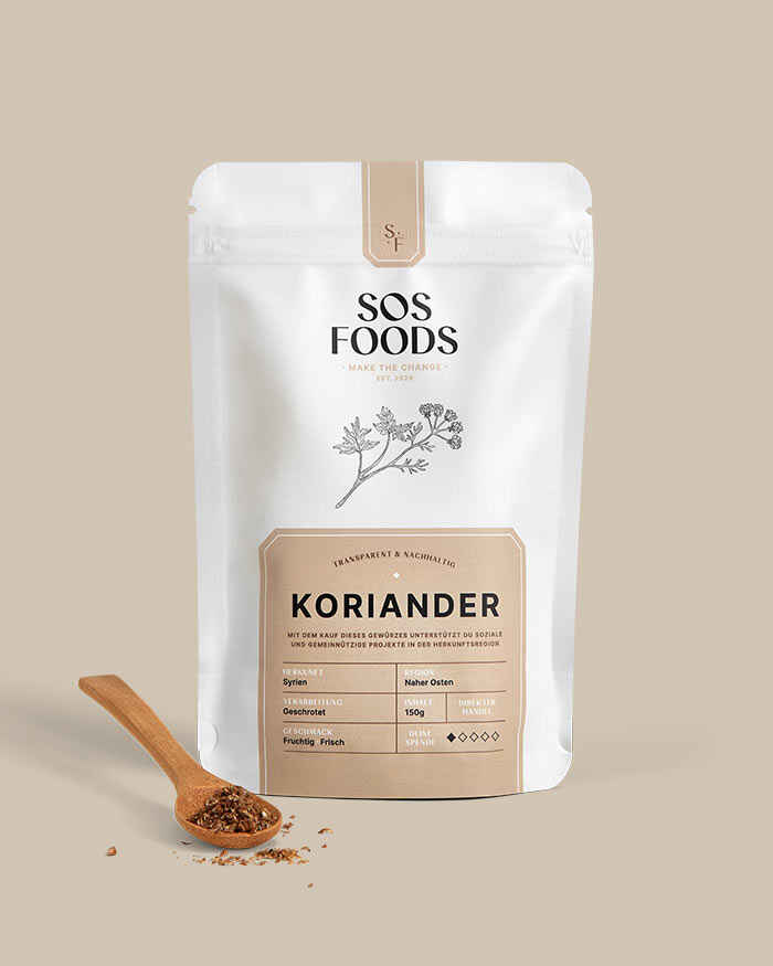
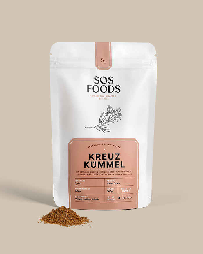
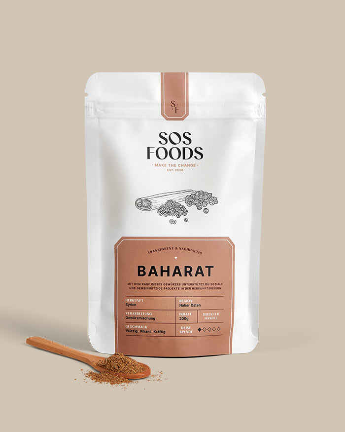
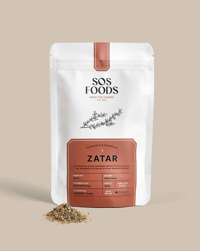
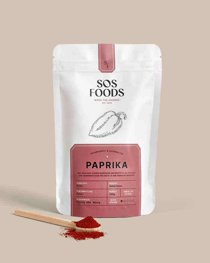
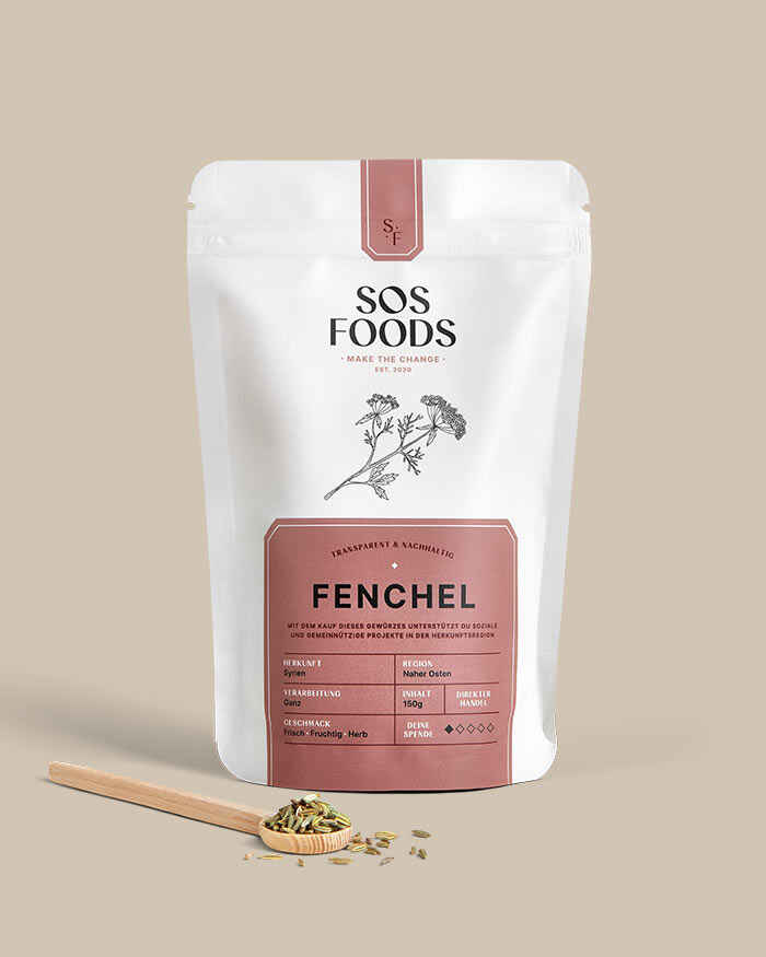
Pack shots
By being present on location during the shooting day, I was able to ensure that the images would go hand in hand with my design.
